SOS Children Villages
Project url: sos-barnebyer.no
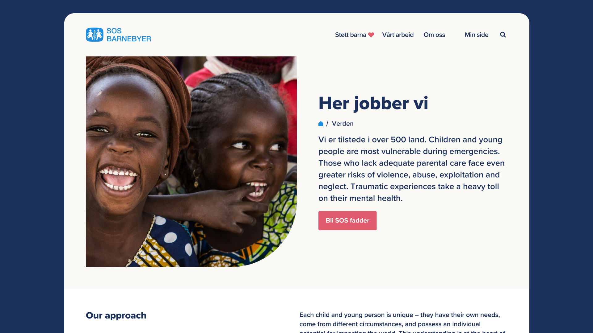
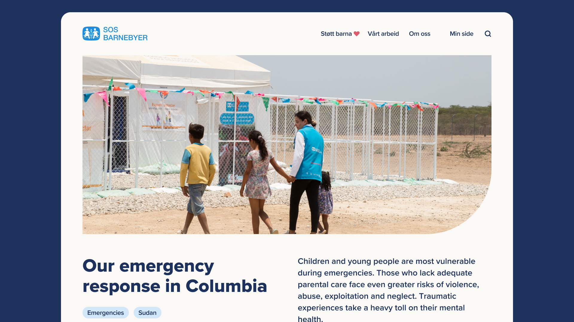
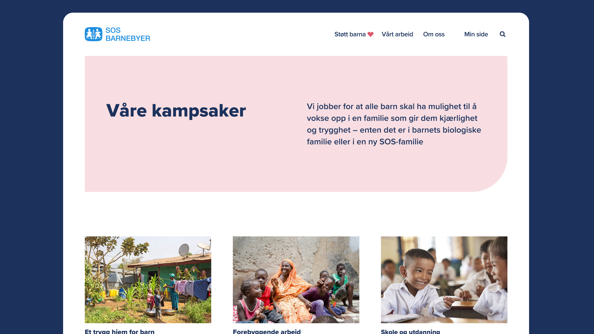
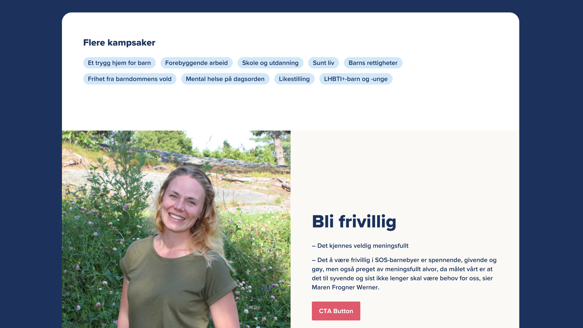
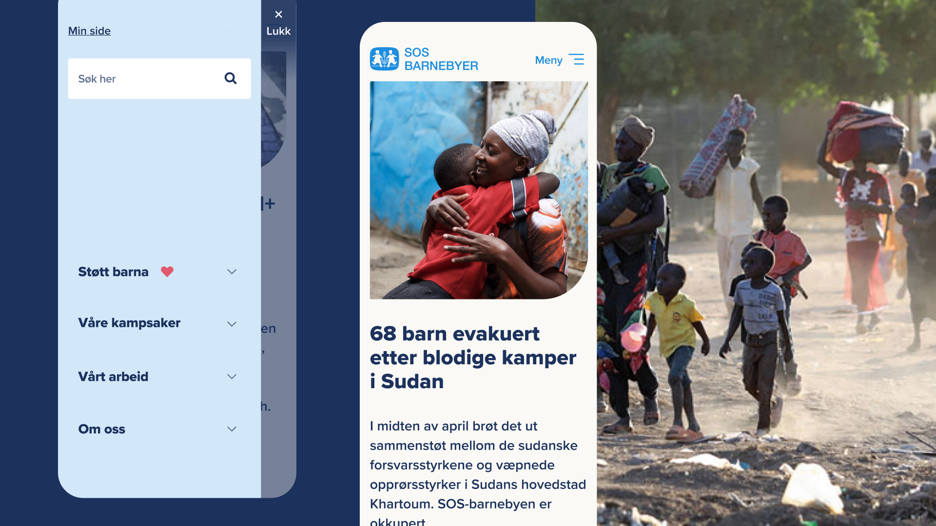
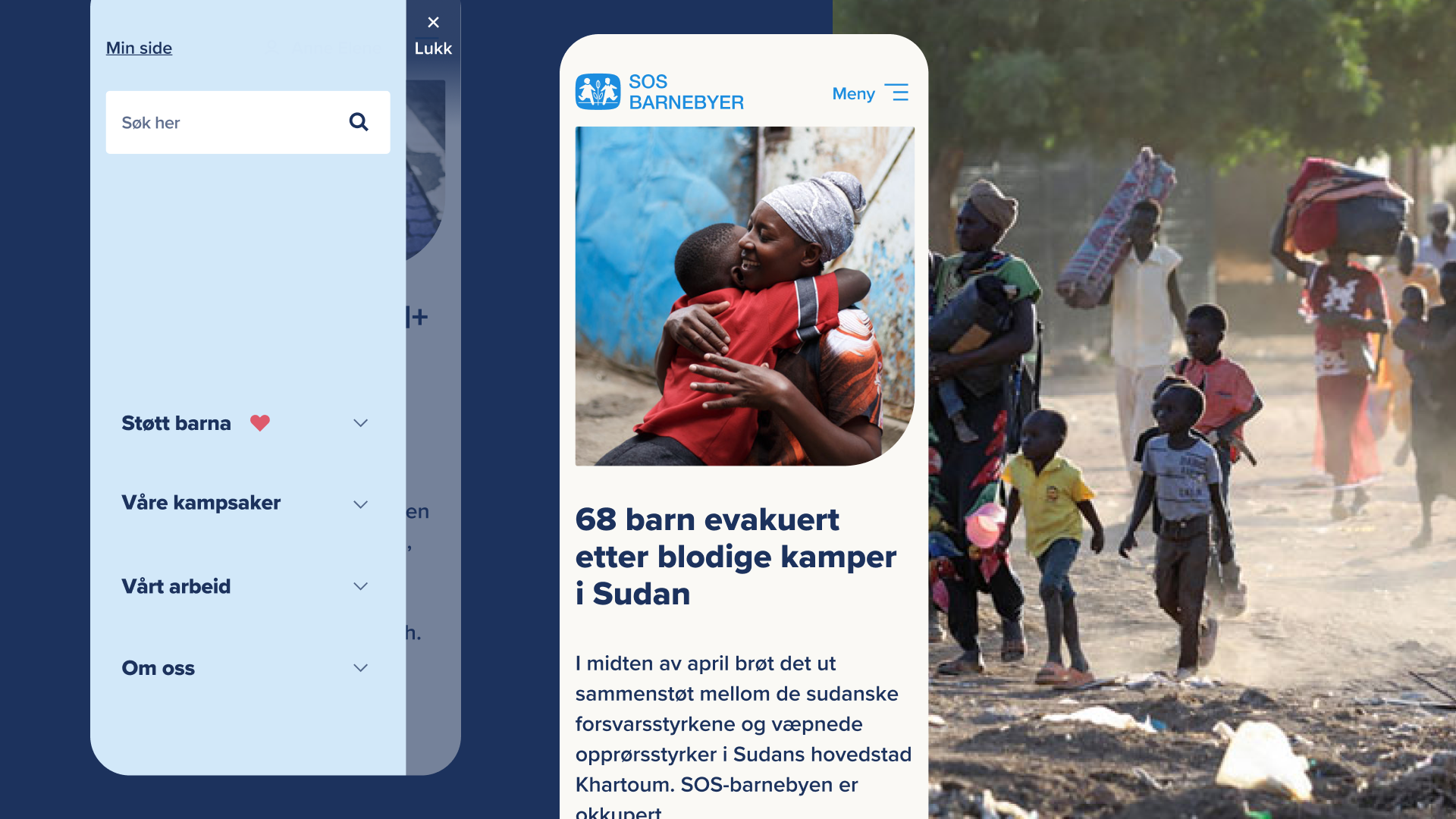
Main goal was to create accessible and engaging website that will help maintain organisation's leading position within the Norwegian humanitarian NGO sector. It's as big as 5 next largest, which presents a challenge to be innovative and introducing new digital strategies.
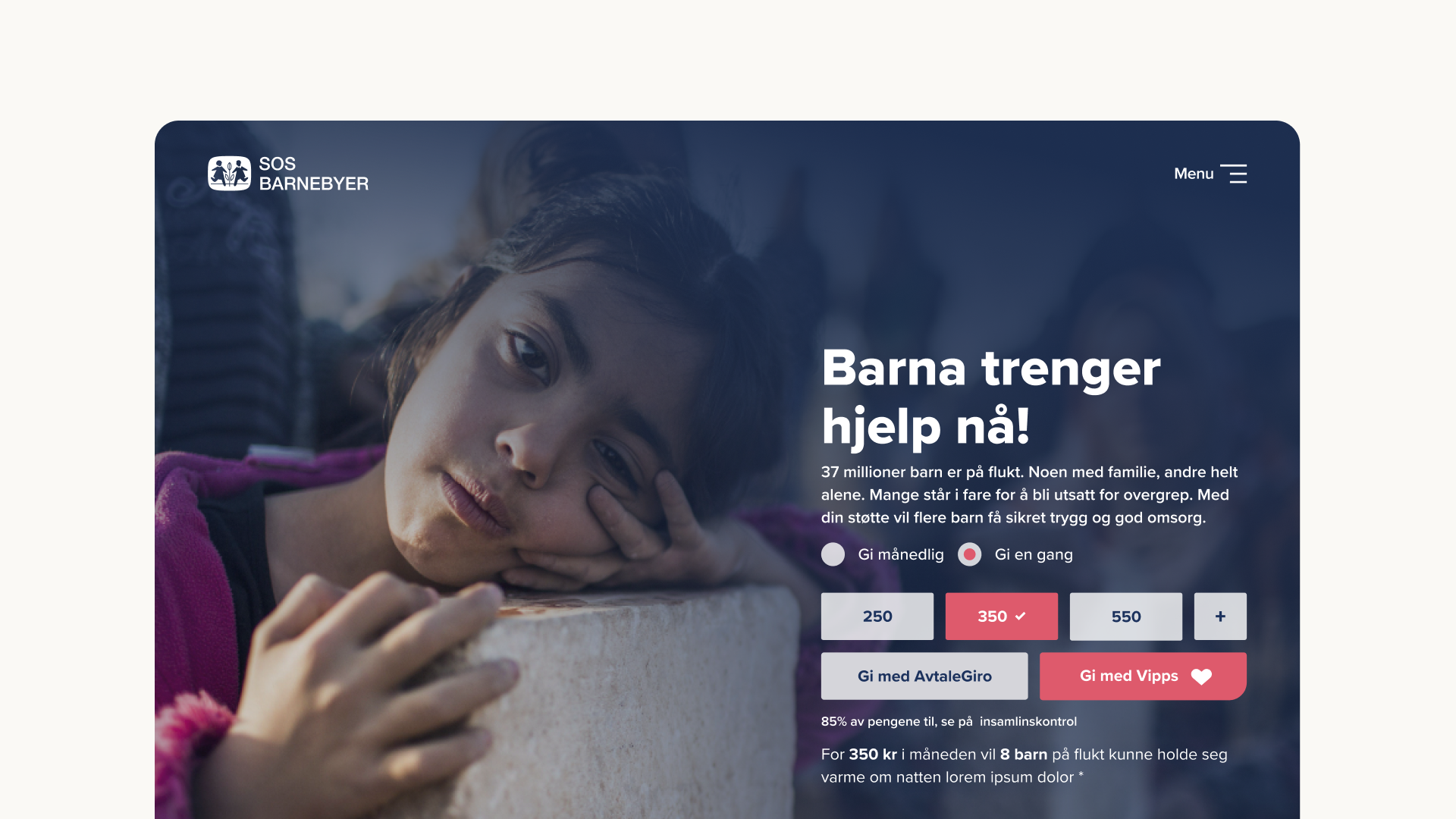
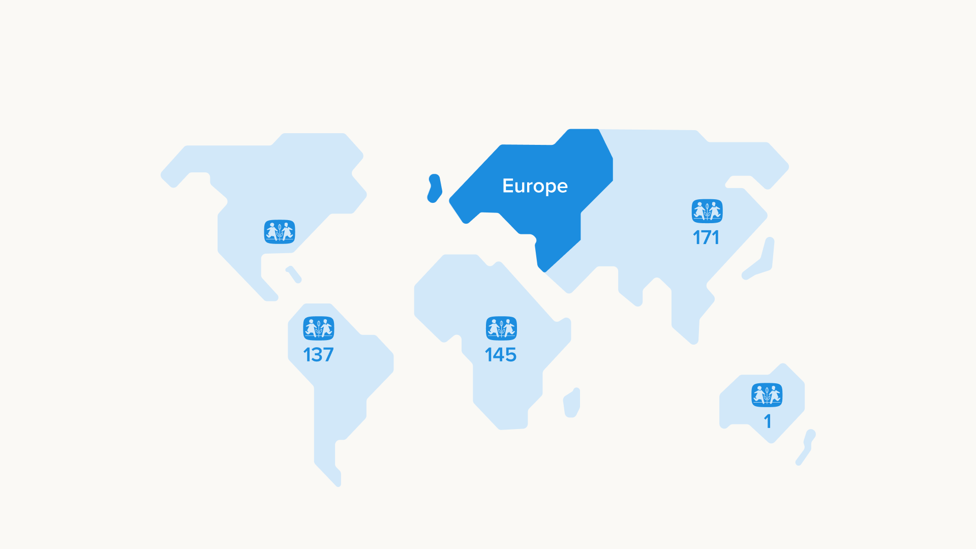
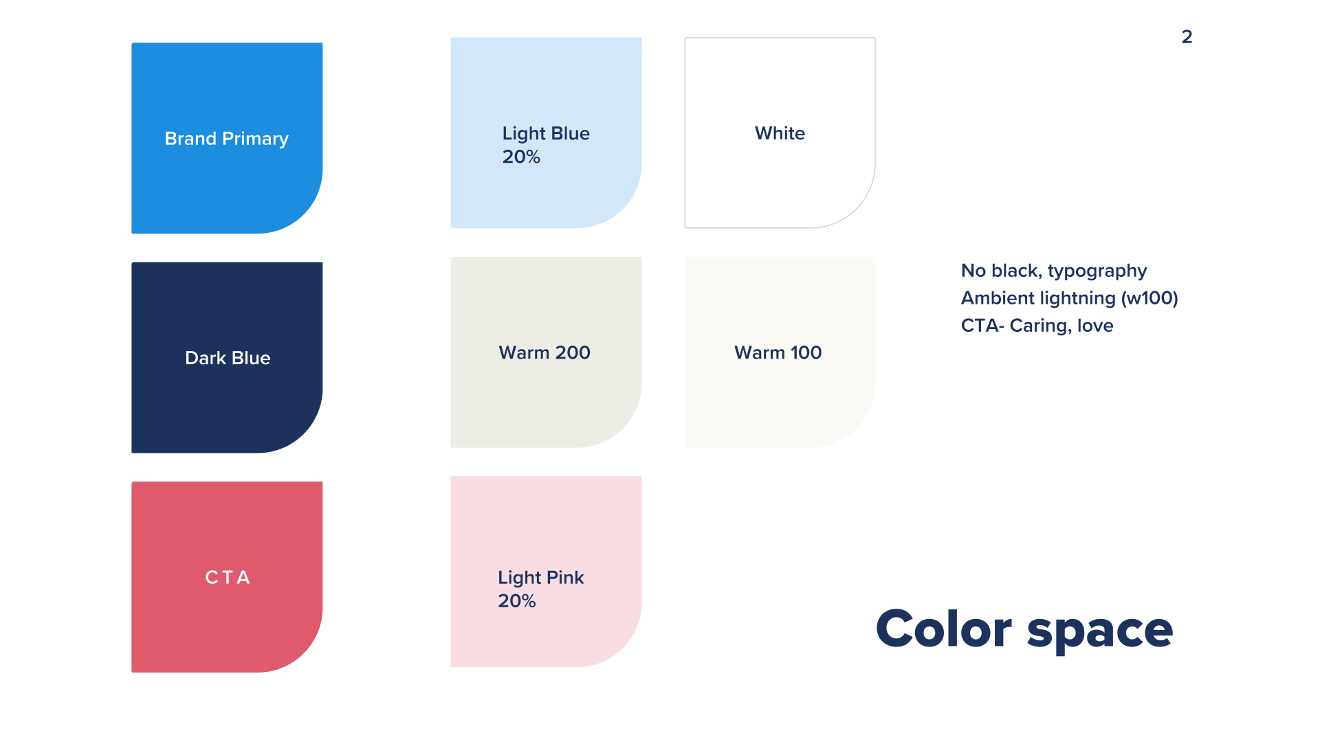
Defining color space that corresponds with international branding while introducing new support colors. Each regional branch of this international organisation has its own expression that corresponds to local culture.
SOS Children Villages has one of the most detailed Brand Books which helped organisation's global recognitions. It was very focused on print and physical space, however when it comes to digital it was bit dated. Web technologies, accessibility standards and UX practices had to be improved.