National Library of Norway
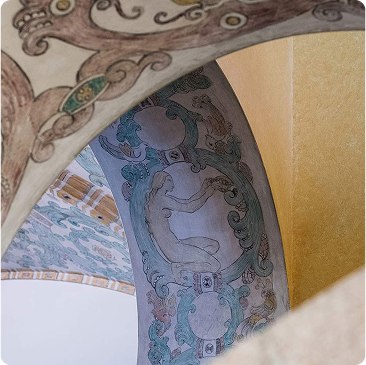
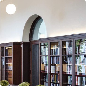
Colors and vibes
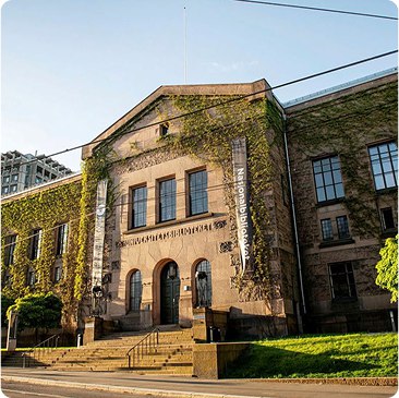
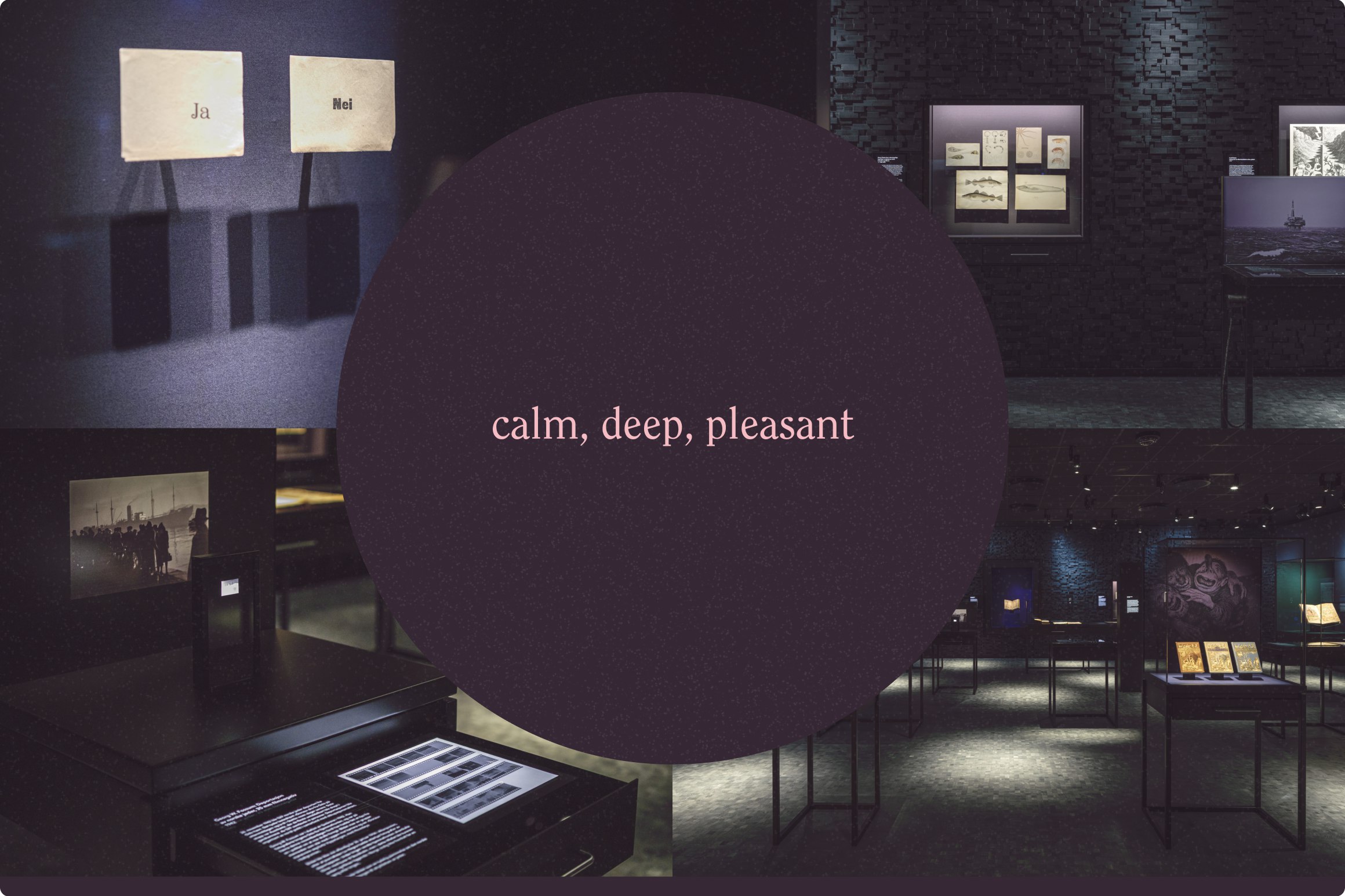
Visit to Nasjonalbiblioteket brought some natural insights when discussing the future brand experience. The interplay of color shades, varied textures, and thoughtful lighting creates an atmosphere that invites people to stay, explore, and feel genuinely welcome.
There's a warmth here that feels like a second home. The careful curation makes information approachable rather than overwhelming, and this visual expression became our direction for the visual identity and website.
Typography
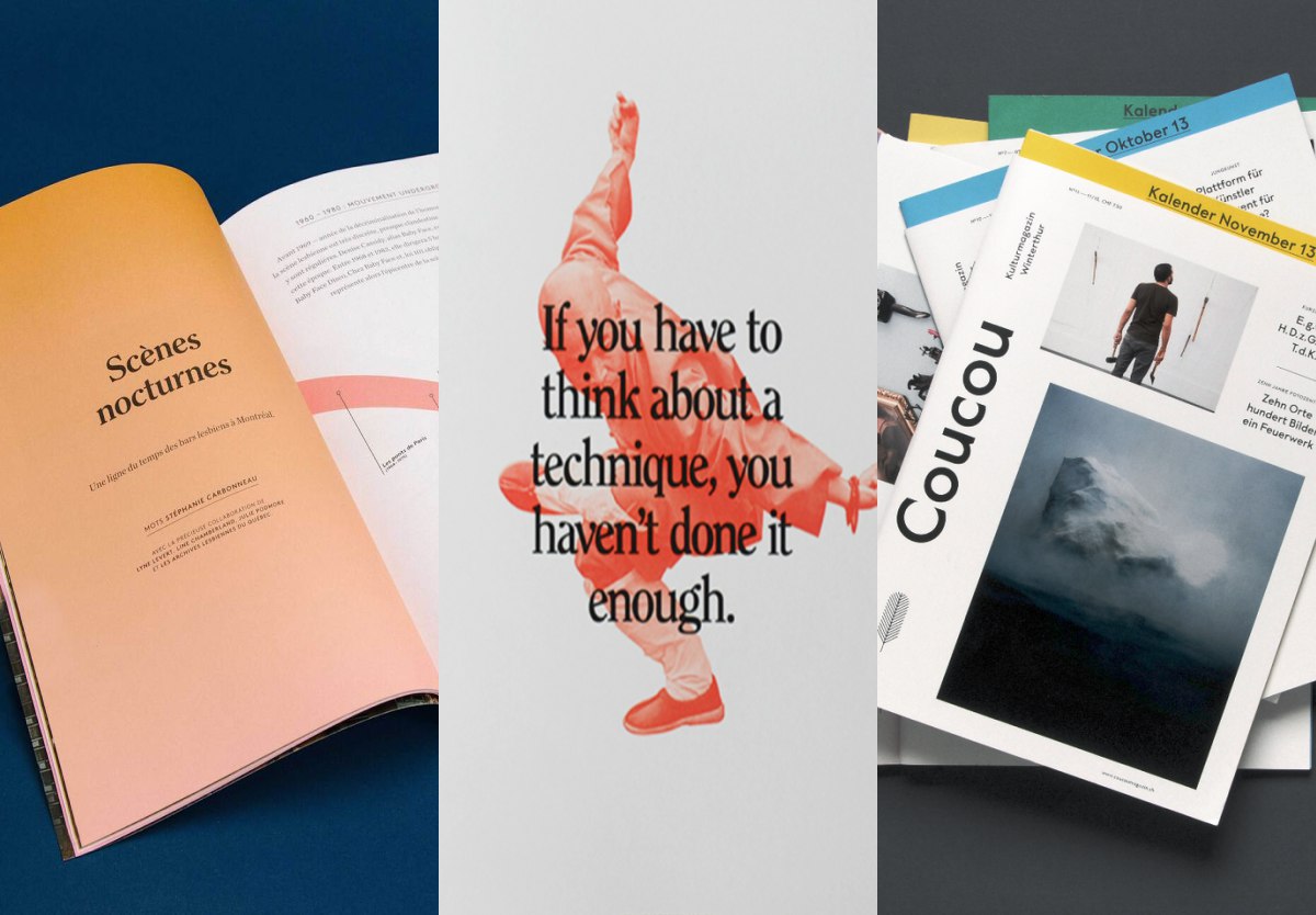
ITC Clearface represents a thoughtful choice for headline typography, where design balances heritage and contemporary forms. Its narrow serif characteristics meet web design trends and create visual contrast and elegance while maximizing space efficiency. The typeface offers both historical gravitas and modern readability, making it an ideal choice for digital platforms that need to convey authority and accessibility simultaneously.
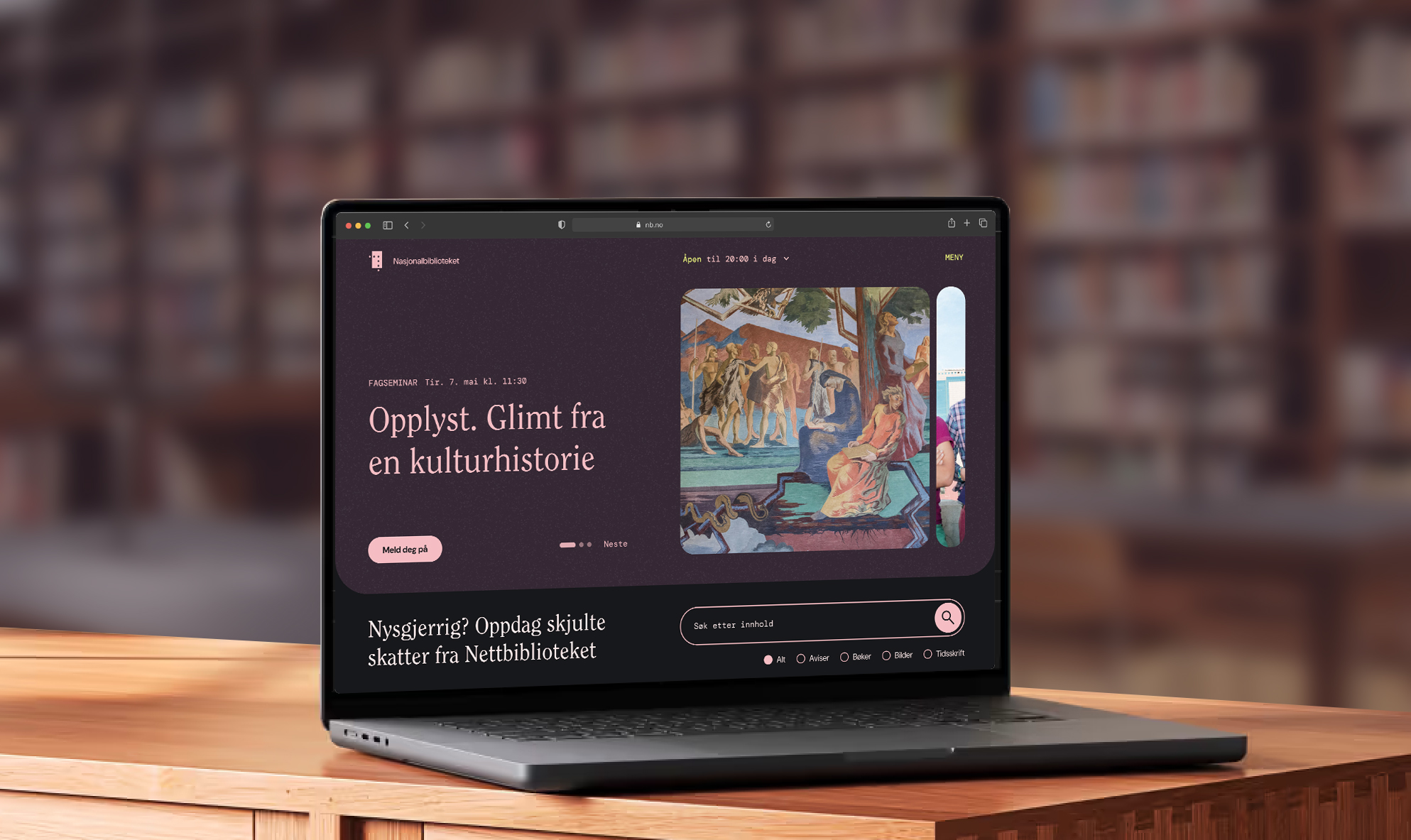
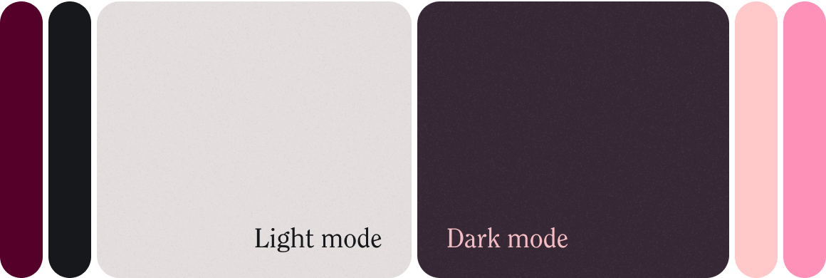
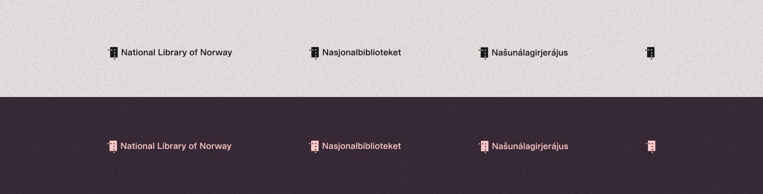
Light / Dark mode
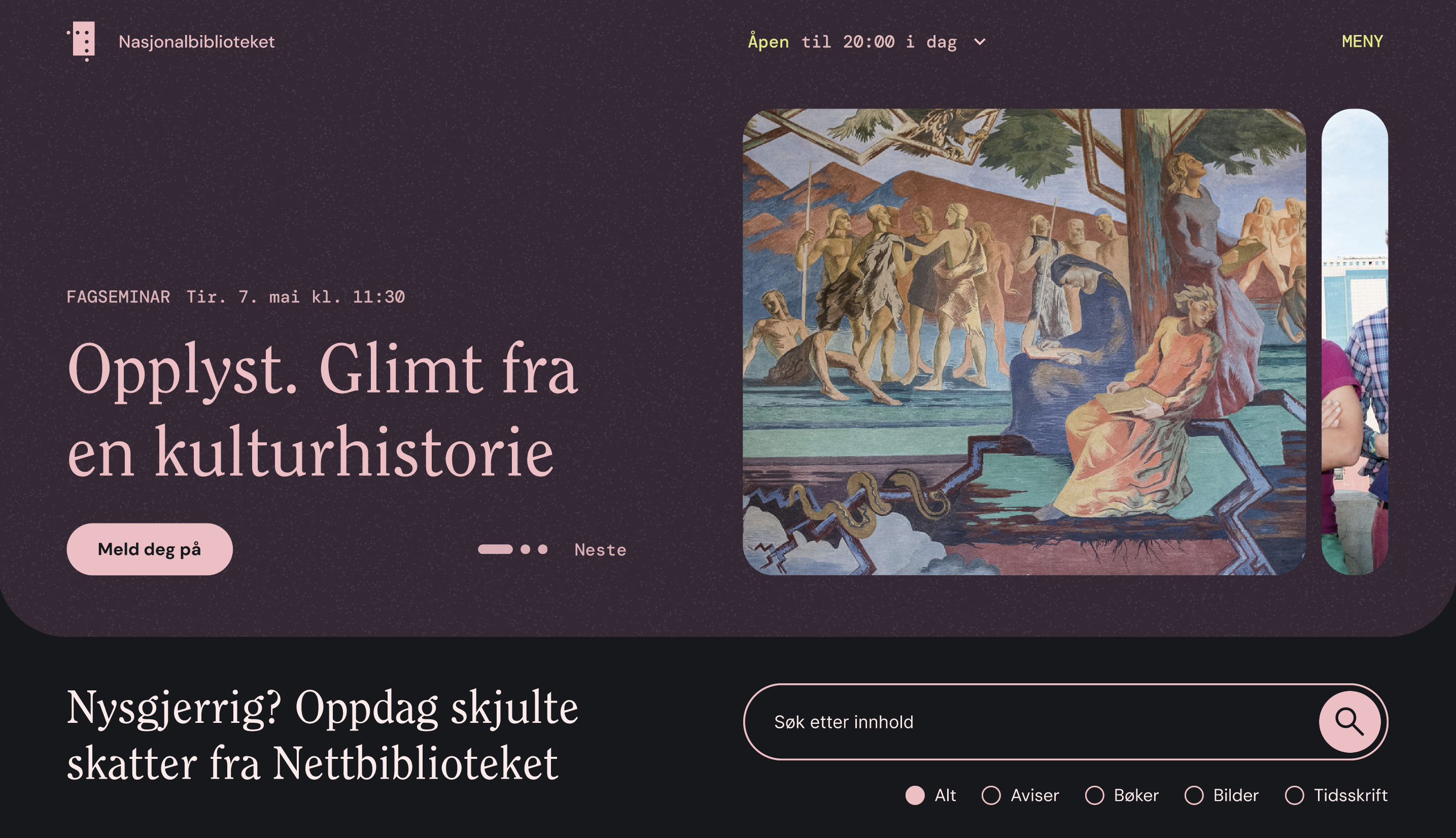
We prioritised the dark mode option because visitors who spend more time on the library website tend to use it.
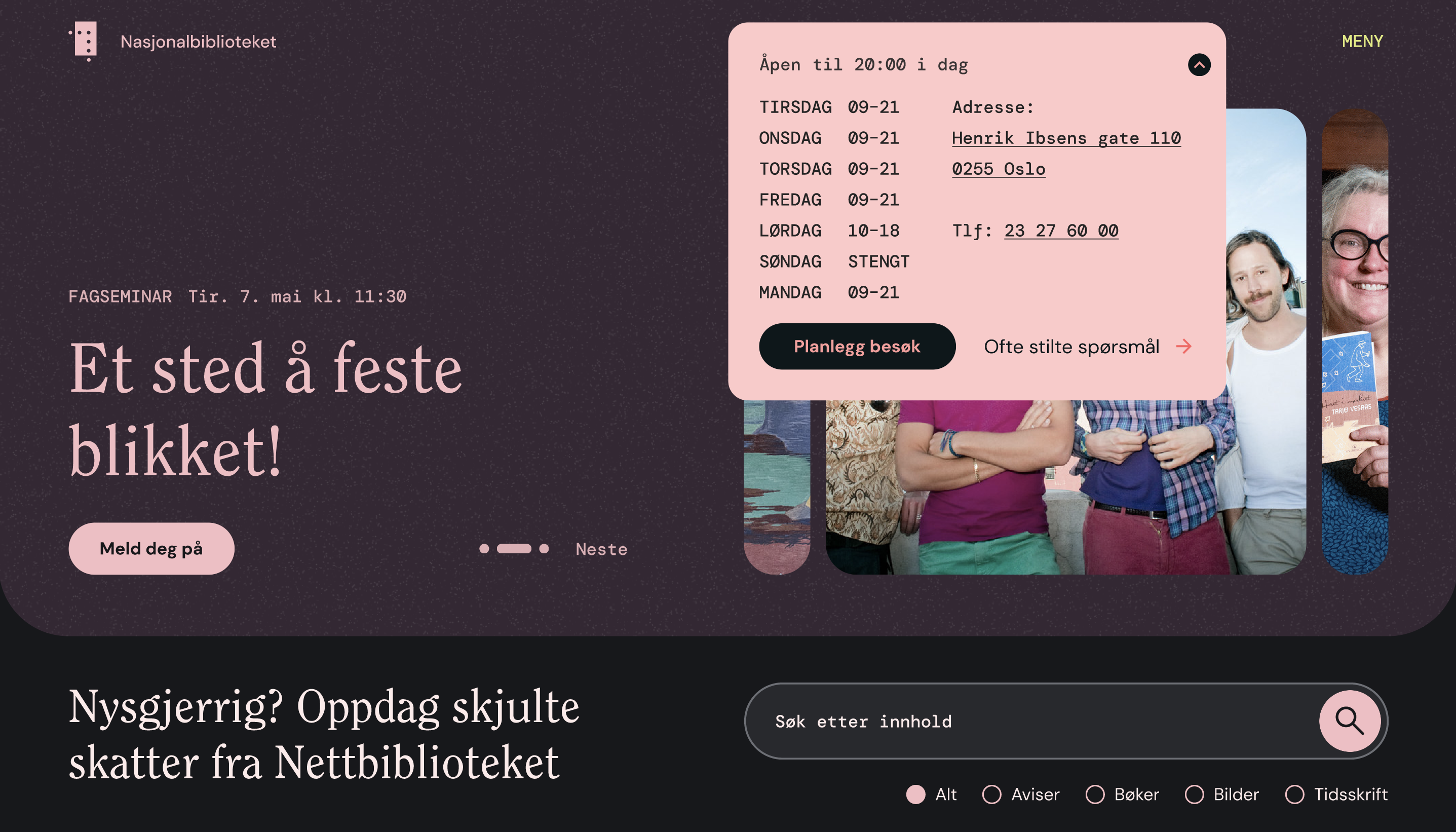
Startpage Viewport
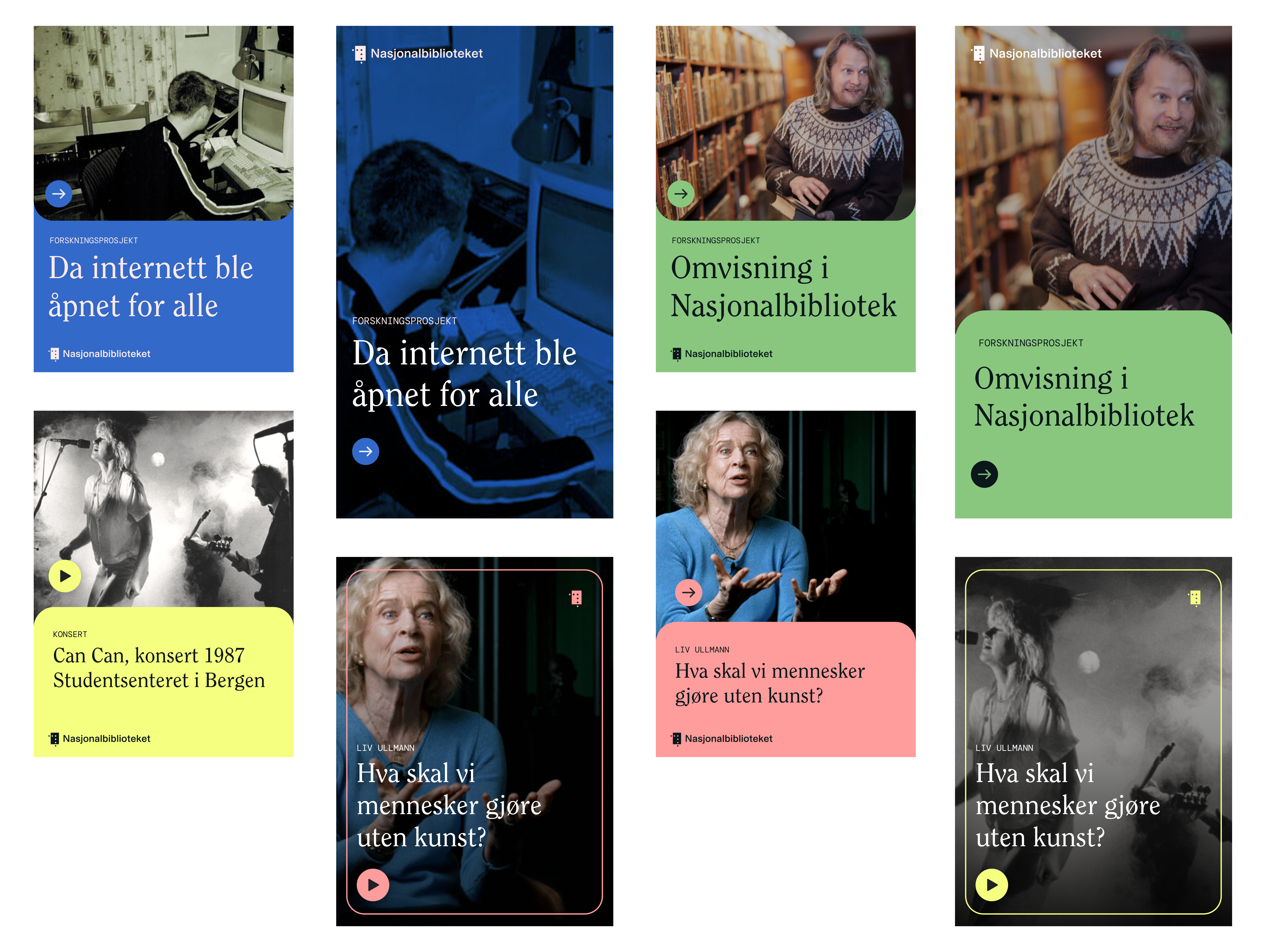
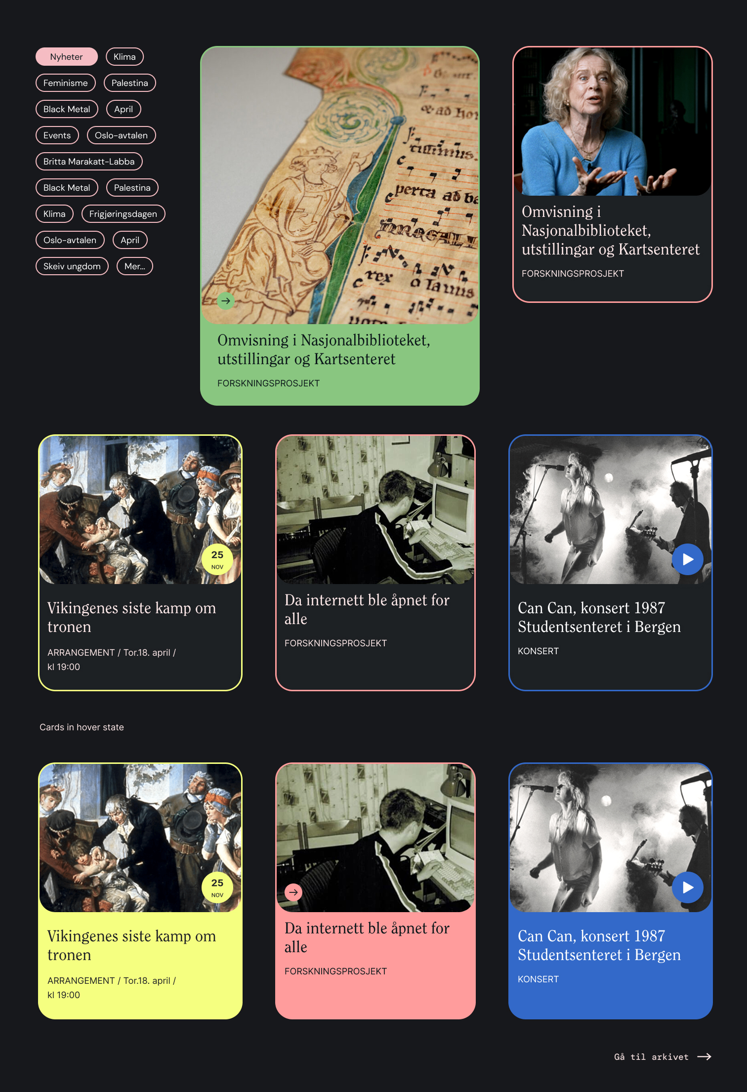
Featured Content Cards
Opening hours widget
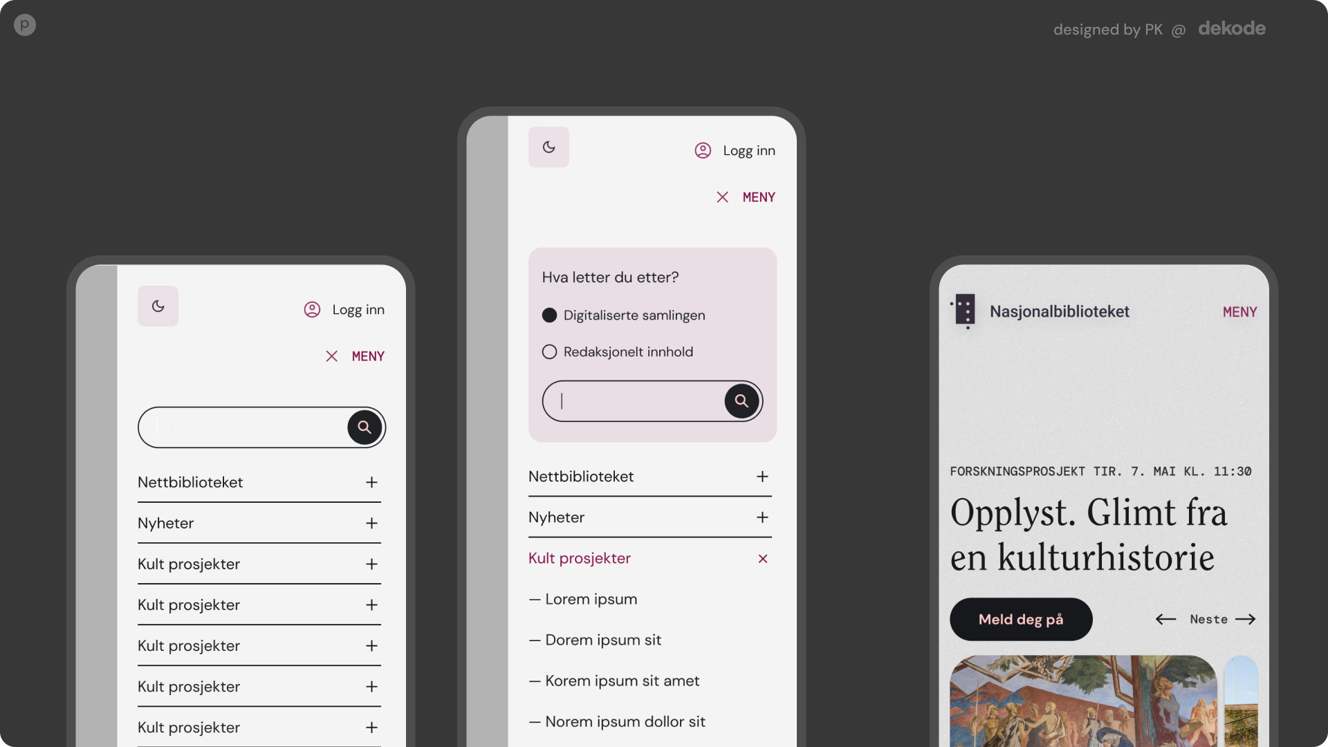
Mobile view
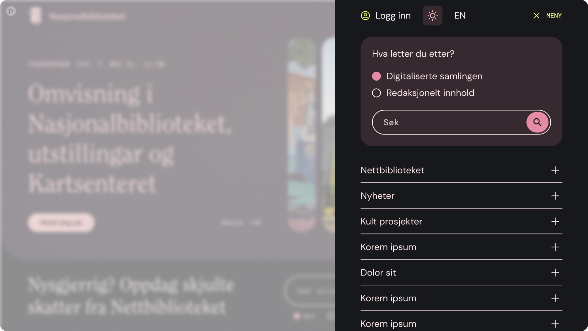
Simplified navigation and search
Light mode version