UX Design Workflow
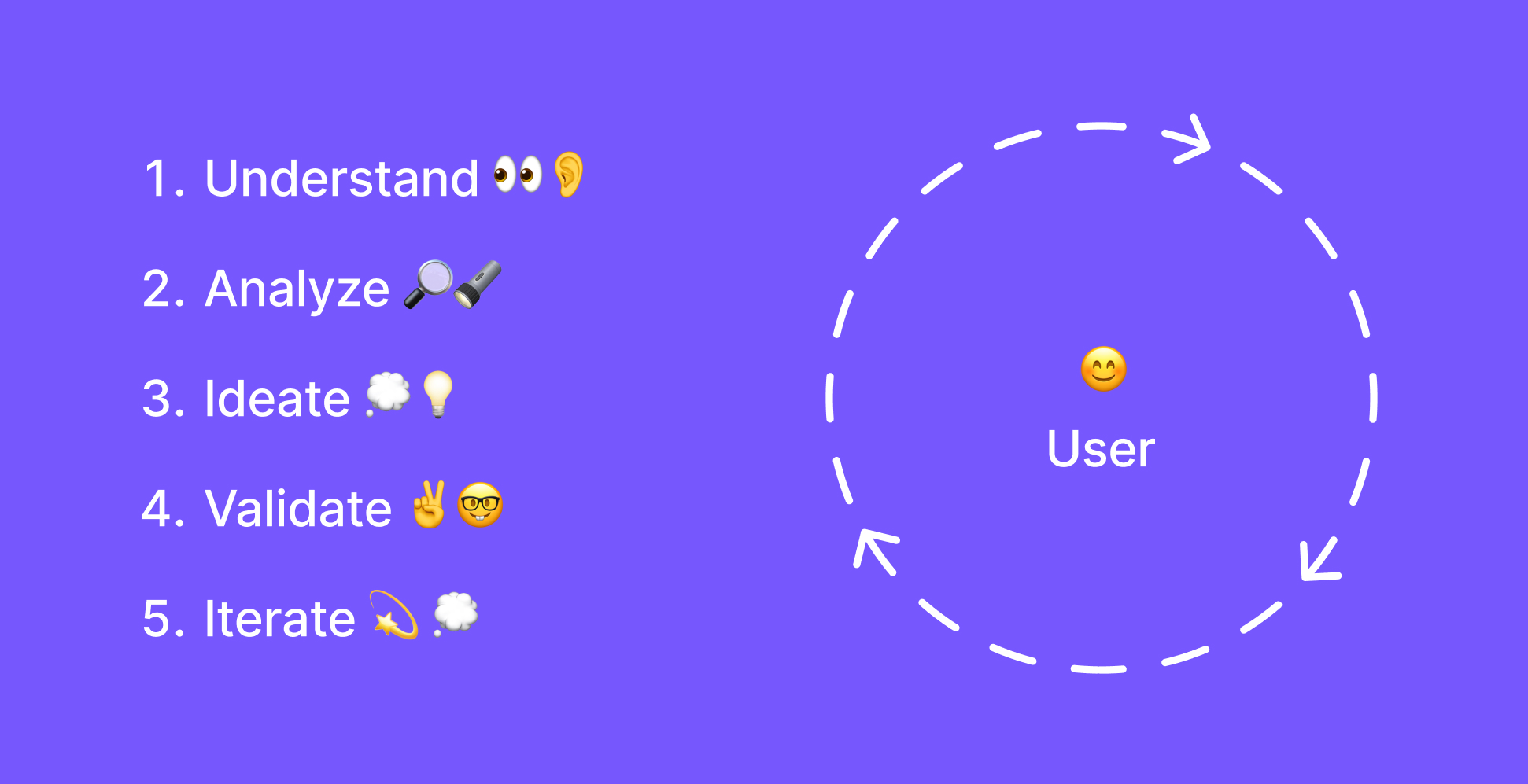
My Design Process – The Five Stages of UX
Years ago I built a management system for Norwegian driving schools. Before designing anything, I spent time watching instructors juggle with schedules, phone calls and impatient students. None of it was in the brief. Fifteen years on, I still start every project the same way: with the people who will use it, in the place they will use it.
Most of my work since has been for public institutions and NGOs, including Nasjonalbiblioteket, Statped and the Equality and Anti-Discrimination Ombud (LDO). Their users are rarely calm and focused. Many arrive stressed, in crisis, or reading in their second or third language.
Someone on LDO's site after experiencing discrimination is not browsing. They're coping. Their attention is fragmented, they read less carefully, and they have no patience left for confusing navigation.
So universal design runs through my whole process, from the first interview onward, instead of being checked at the end. WCAG and W3C's cognitive accessibility guidance (COGA) shape how I research, analyze, sketch, test and improve. Below are the five stages I work through, and what each looks like in practice.
1. Understand: Starting With the User's Reality
I start by talking to users and watching them work. I want to hear their frustrations in their own words and see where current solutions trip them up. For the driving school system, that meant sitting with instructors through ordinary working days.
I also ask what state people will be in when they use the service. A parent filling in a school application at 23:00 after a long shift. A person reporting discrimination while still shaken by it. Stress narrows attention and makes vague language much harder to follow, so research that only meets users at their calmest describes someone who may not exist at the moment of use.
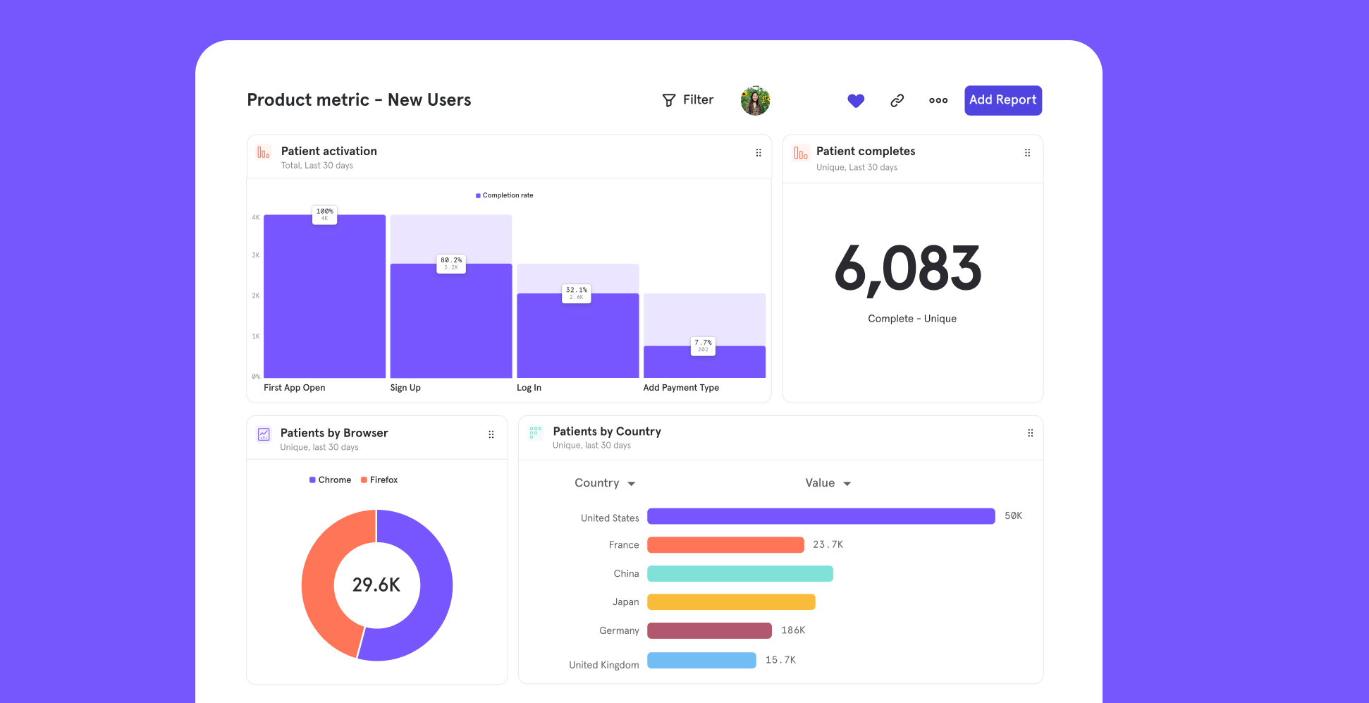
Interviews have limits. People describe what they think they do, which often differs from what they actually do. Analytics fills that gap: which features get used, where people get stuck, which routes different groups take. Interviews tell me why; analytics tells me how often and where.
2. Analyze: Finding Patterns in the Noise
Next I sort interview notes, survey answers, analytics and support tickets into patterns. Three users describing the same frustration is a signal. A drop-off in the analytics at the same step people complained about in interviews is a priority.
Journey maps show whether a problem sits at one step or builds up across several. Funnels show where people give up, and heatmaps show what they click and what they ignore. I also look at where the drop-offs happen. Steps that demand memory, dense reading or unfamiliar terms hit people with cognitive disabilities hardest, and anyone under acute stress almost as hard.
On LDO's website, this showed that people were looking for cases similar to their own and getting lost in the general structure. Search use was high and time on the category pages was short: visitors couldn't tell quickly whether the content applied to them. For someone already in a difficult situation, that dead end can be the moment they stop looking for help.
3. Ideate: Generating Solutions Grounded in Evidence
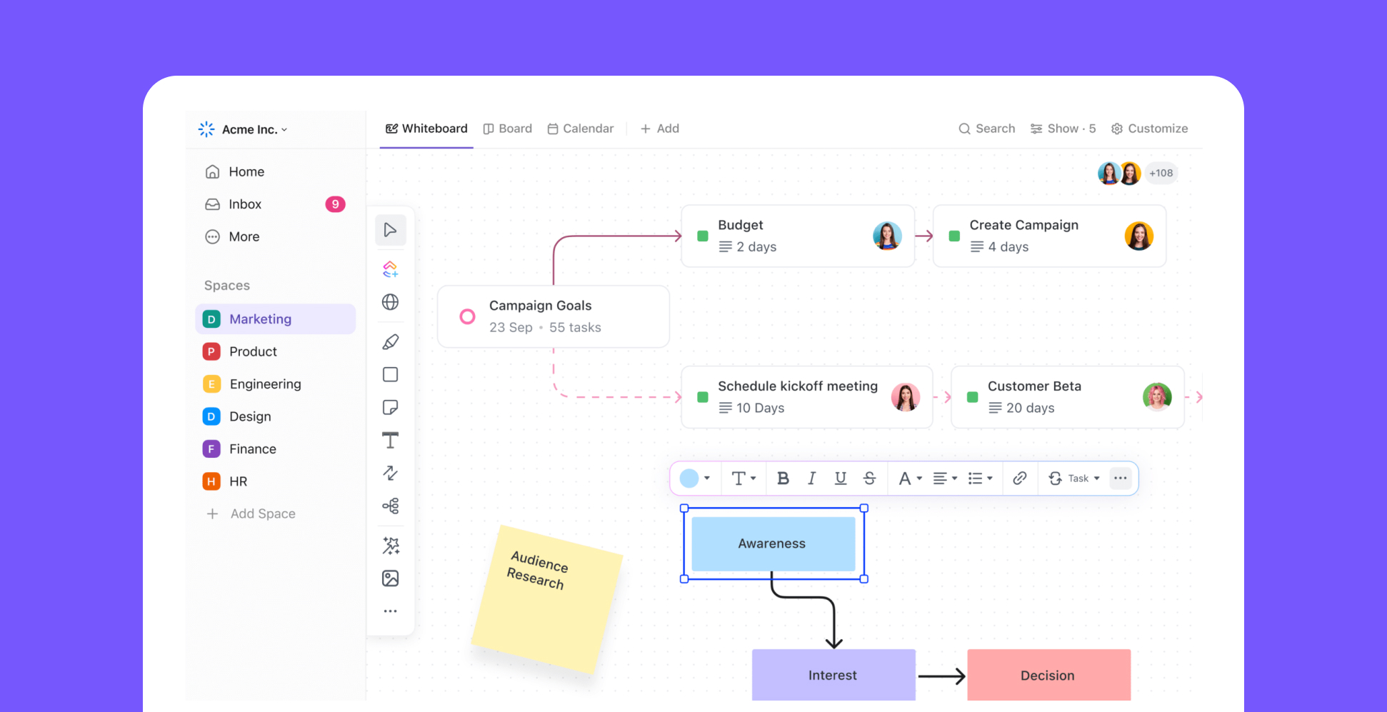
I sketch a lot: wireframes, user flows, rough interface concepts. For any significant problem I explore at least three directions before choosing one, and the final solution is often a mix of them.
The analysis sets the constraints. If most visits come from phones, the mobile layout comes first. If session recordings show people clicking something that isn't clickable, it either becomes a link or stops looking like one.
COGA's design goals add constraints of their own, and useful ones: make it obvious what things are and how they work, don't rely on memory, use language that can't be misread, and give people predictability and control. In practice that means autosave instead of time-outs, error messages that explain how to fix the problem, and a summary before anything irreversible, like submitting an application or making a payment. On sensitive services it can mean a quick-exit button.
4. Validate: Testing Before You Build
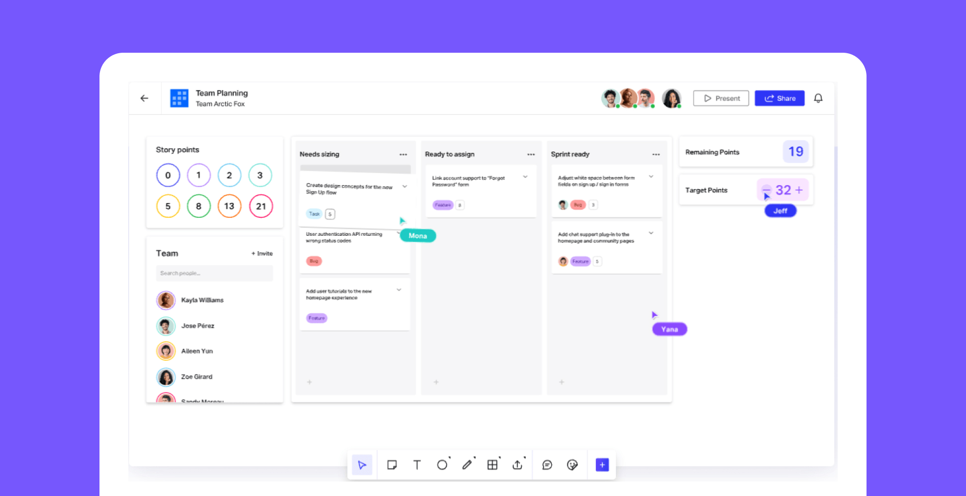
Testing before building is the cheapest way to find out what's wrong. I test with prototypes ranging from paper sketches to clickable high-fidelity versions, depending on the question. Navigation concepts work fine on paper; subtle interactions need something closer to the real thing.
Who I test with matters as much as what I test. A design that works for confident, tech-savvy participants says little about how it works for the people who need it most. I recruit participants with cognitive disabilities, low digital confidence or limited Norwegian, often through volunteer organizations and patient associations who can arrange sessions somewhere participants feel safe.
The question in testing is whether people can do what they came to do: find the information, understand the key features, and recover from an error without getting more stressed. A design that fails in testing costs me a few days. One that fails after launch costs most for the people with the least capacity to work around it.
5. Iterate: Continuous Improvement Based on Real Usage
After launch, real use shows what testing missed. I follow goal completions, look for new friction points, and check whether changes actually moved the numbers they were meant to move. On WordPress sites this matters a lot: a template that worked with test content can break in unexpected ways once editors fill it with real material.
For this I use Matomo, an open-source analytics tool where the data stays under the client's control. When users include people in asylum processes, people seeking help after discrimination, or people reading about sensitive health issues, tracking is an ethical choice as much as a technical one. These users have good reasons not to be profiled by third parties, and privacy-friendly analytics also spares them yet another consent banner.
What I learn here goes straight back into the first stage: new problems, assumptions that turned out wrong, things we missed. I look for these actively instead of waiting for complaints.
Necessary for Some, Better for Everyone
Everyone will at some point use a digital service with no mental energy to spare. Illness, grief, money trouble, a screaming toddler, plain exhaustion. When I design for people with cognitive disabilities or people in vulnerable situations, I'm designing for a state every user will be in sooner or later.