AAA Accecibility Websites
WCAG (Web Content Accessibility Guidelines) is about ensuring that websites and digital content work for everyone, regardless of their abilities or disabilities.
WCAG 2.2 is about digital equity - ensuring that when you visit a website or use an app, you have the same opportunity to access information, complete tasks, and participate online as anyone else, regardless of whether you use assistive technology or have different needs than the "typical" user.
It's essentially a set of standards that, when properly implemented, makes the web more usable and inclusive for everyone.
AAA
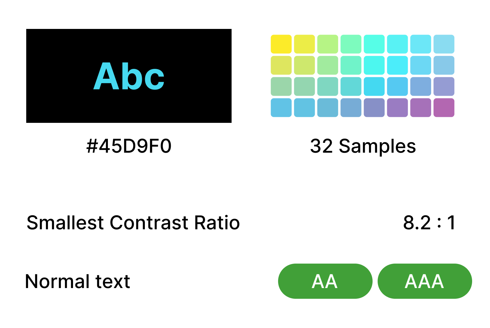
AAA compliance provides the most comprehensive accessibility experience, this requirements can be extremely difficult to meet for all content. For following project I was a design lead. Strategic approach on these projects was rather than trying to meet technical compliance criteria, focus on enabling specific use cases - like "support navigation without a mouse", "support light sensitive interface"...
Keyboarding
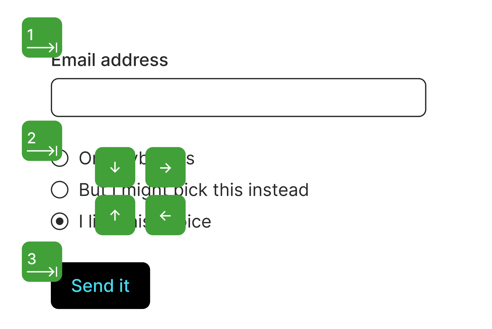
Users with a wide range of disabilities, or no disability at all, rely on a keyboard. All interactive elements should be accessible with the keyboard.
- The tab key navigates in a linear direction through focusable elements like links, form controls, and buttons.
- The enter key (and sometimes space) selects an element.
- Arrow keys move within certain elements, element groups, and widgets. For example, within form select elements, radio button groups, and a set of tabs.
Tibi – The Library for Adapted Literature
Tibi is the library for you who have difficulties reading visual text due to disability or illness. Tibi creates and lend out audiobooks, e-books, and books in braille.
Soft Dark Mode
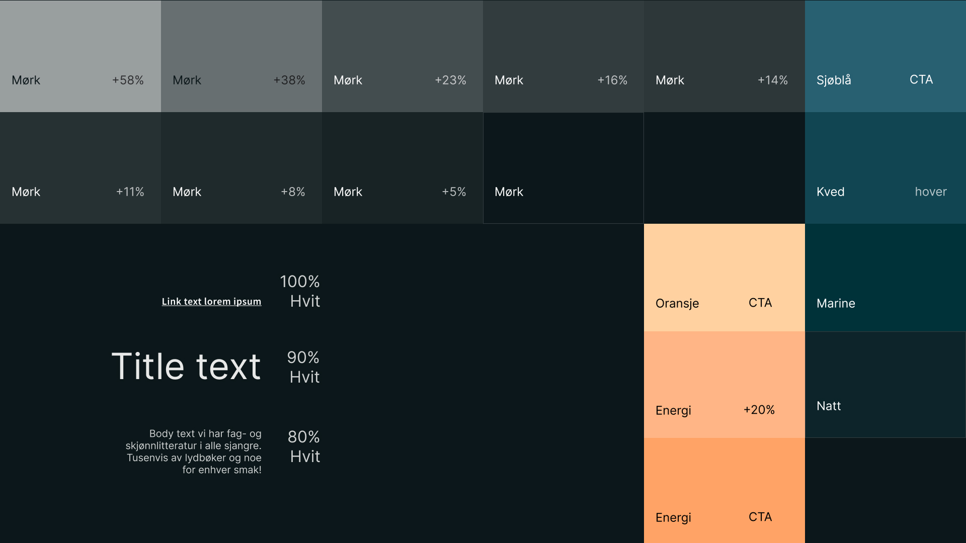
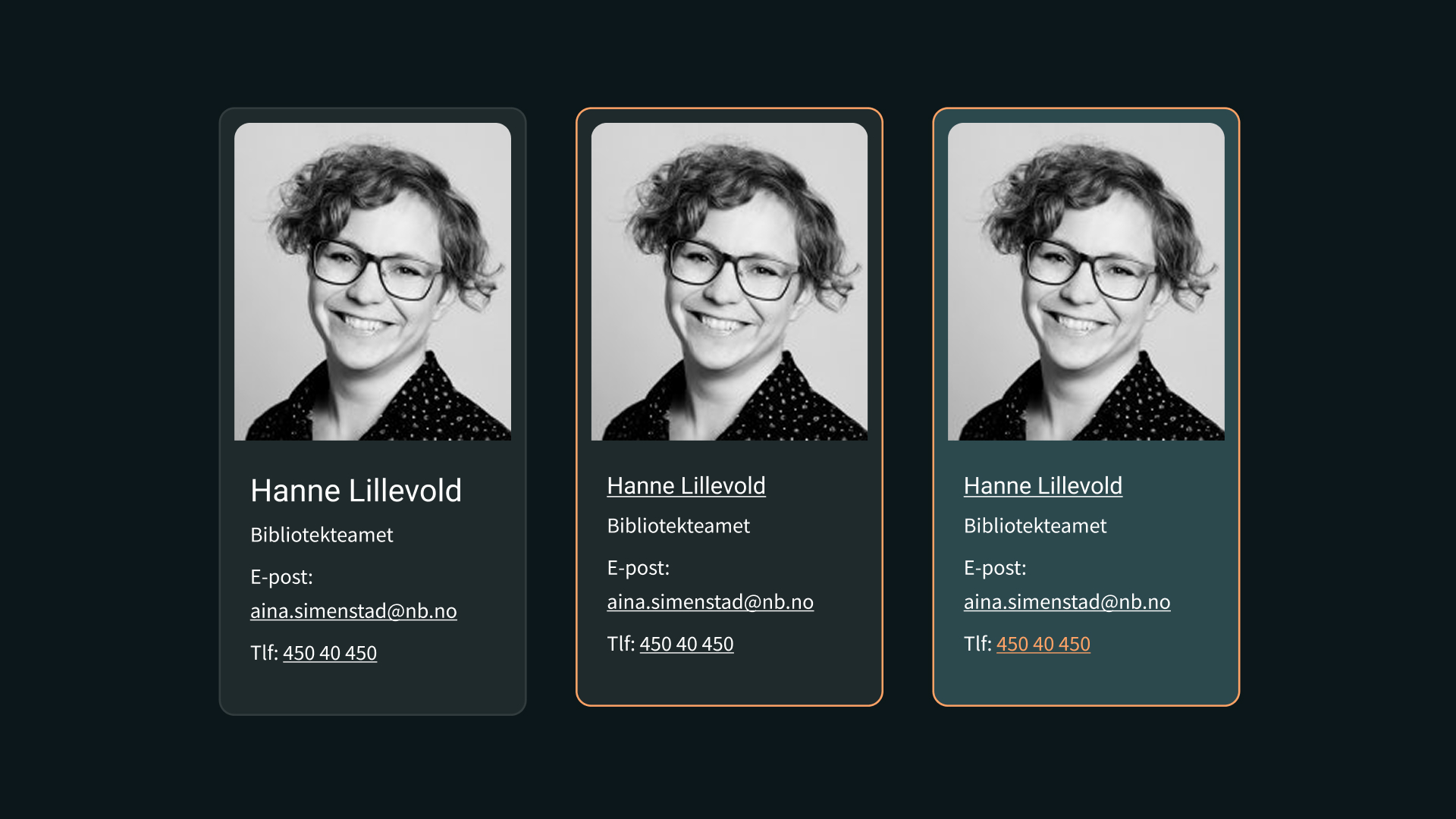
Default mode chosen by Tibi is dark. Tibi's soft dark mode user interface design uses dark colors with softer tones, creating a visually comfortable experience. This design is popular for reducing eye strain, especially in low-light environments.
Key Features of Soft Dark Mode
* Color Palette: Utilizes muted colors rather than pure black, often incorporating shades like dark gray, navy, or deep green.
* Eye Comfort: Softer contrasts help minimize glare and make reading easier on the eyes.
* Customization: Many applications allow users to adjust brightness and contrast settings to suit personal preferences.
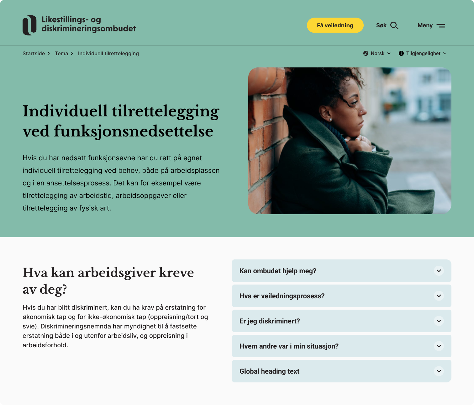
LDO – Likestillings- og diskrimineringsombudet
(The Equality and Anti-Discrimination Ombud)
The Equality and Anti-Discrimination Ombud exists to promote equality and combat discrimination based on gender, pregnancy, parental leave, ethnicity, religion, disability, sexual orientation, gender identity, gender expression, age, trade union membership, and political views. The Ombud is professionally independent. They are organized under the Ministry of Culture and Equality, but cannot be instructed by the authorities.
AAA was not requirement for this project but we achieved very high score after being tested by specialised agency.
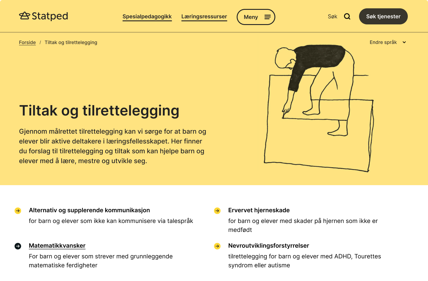
Statped
Statped provides services for children and pupils who need permanent and comprehensive accommodations in kindergarten and school. They are helping PPT (Educational and Psychological Counseling Service) with services and competency development, providing education in and through Norwegian sign language, in Sami, and by producing educational materials and resources.
AAA accessibility was the requirement since it provides services and content for kids with special needs.
Content is in development...