Ordering Application
- Created:
- March 2024
- Client:
- Establishing design system and improving ordering experience flow
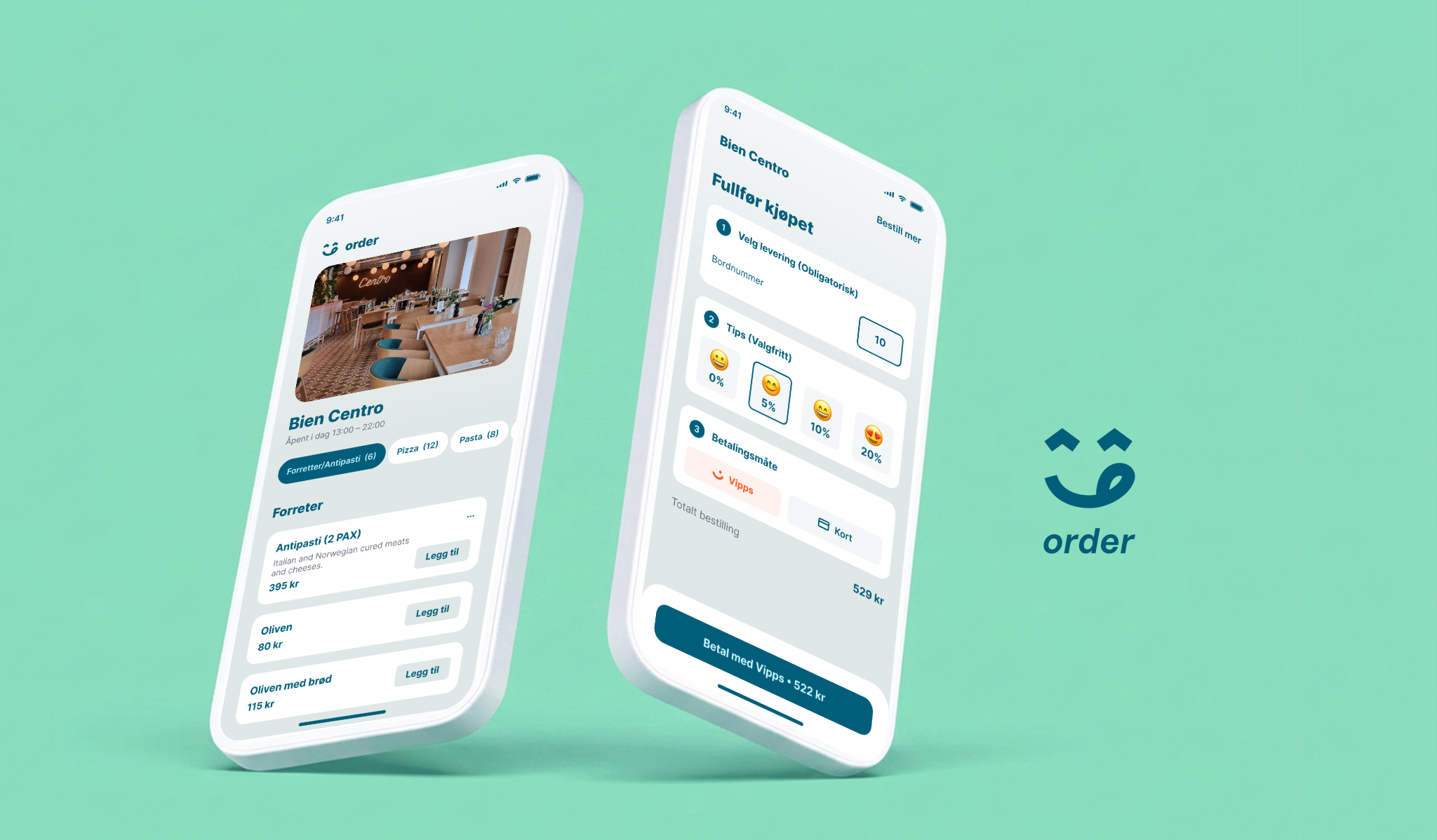
order — Rethinking at-the-table ordering for restaurants
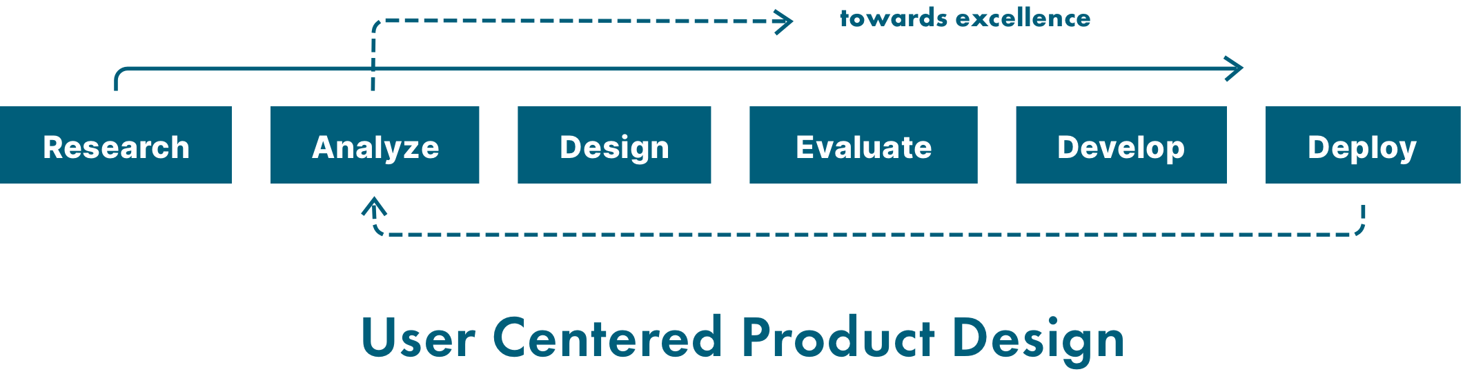
Role: Product designer · research, UX/UI, prototyping Process: User Centered Product Design
Scope: Analysis of existing solution → redesign → validation with guests and restaurant clients Platform: Mobile web app (QR-initiated, no download)
The brief
The client had an existing QR-based ordering solution used in casual dining restaurants. It worked technically, but restaurants reported that guests still relied on waiters for basic questions, and many started an order without completing it. The task was to analyse the existing solution and design an improved product — not a visual refresh, but a rethink of the flow based on how people actually behave at a table.
Research
I started by understanding both sides of the product: guests and restaurants. This included a walkthrough and heuristic review of the existing solution, conversations with restaurant staff and owners, and observation of real ordering situations during service. I also looked at how comparable ordering products handle the same flow.
Analyze
The research pointed to a handful of recurring problems. Guests couldn't find answers about dishes and allergens without asking a waiter. Checkout asked for practical information (like the table number) at the wrong moment, causing drop-offs. Ordering was treated as a single transaction, even though guests at a table order in rounds. And after paying, guests had no idea what was happening with their order — which led straight back to interrupting the staff.
Design
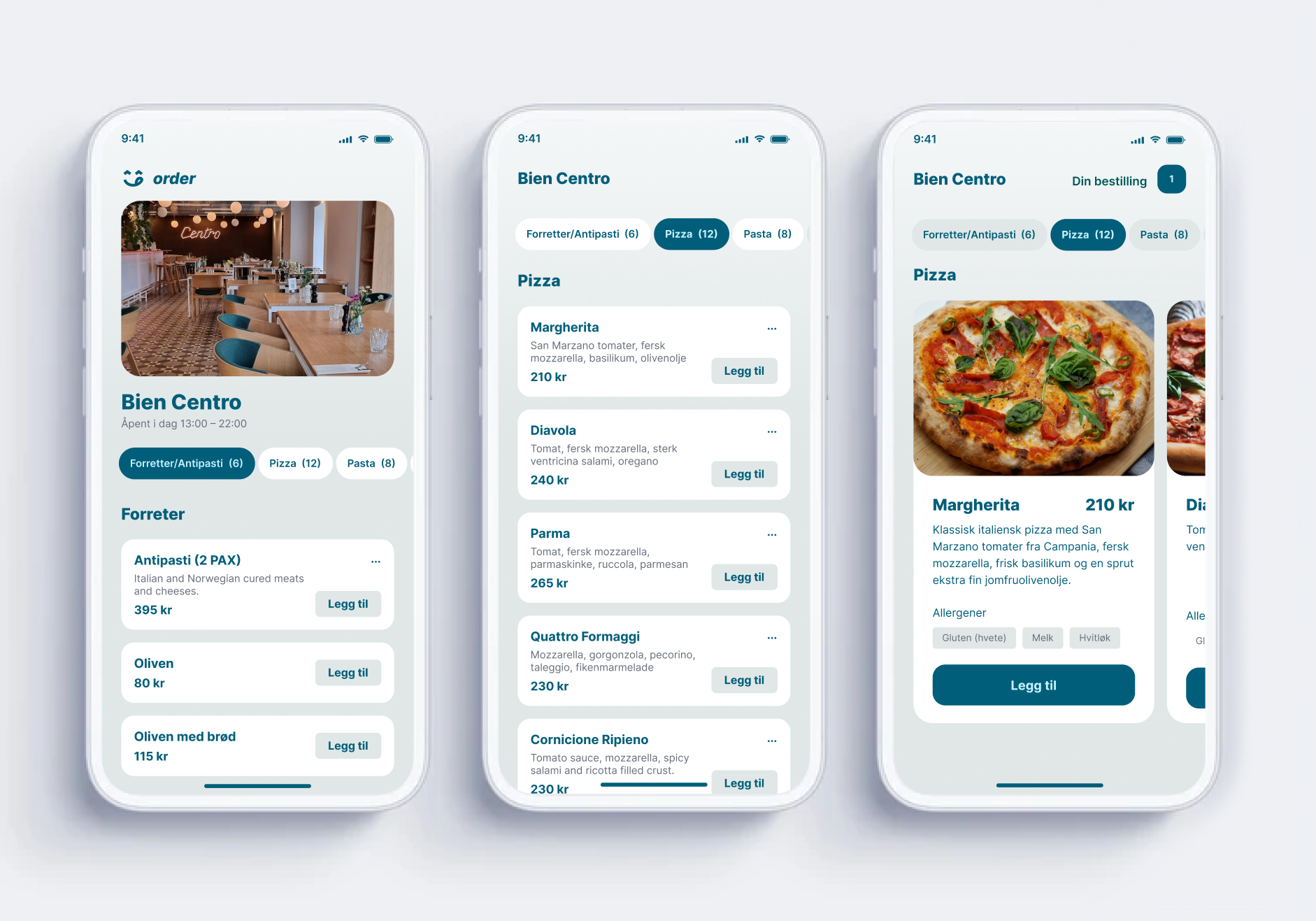
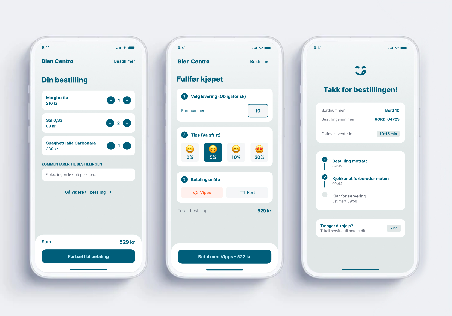
The redesign addressed each of these directly. The menu was restructured as decision support: clear categories, honest ingredient descriptions, and allergens visible on the dish itself. Checkout was reorganized into a simple, logical sequence — delivery, tip, payment — with the table number confirmed first instead of last. Tipping became a set of one-tap options instead of a free-text field. Payment defaults to Vipps, with the exact amount always visible on the button. After payment, a live order status replaces silence, with an option to call a waiter for everything the app shouldn't try to solve.
Evaluate
The design was tested in two ways: usability tests with guests in a realistic table setting, and feedback sessions with restaurant staff. Testing led to concrete changes — among them simplifying the checkout steps, which some participants initially read as a multi-page wizard, and making the table number editable after ordering. Iterating between design and evaluation continued until guests could order and re-order without help.
Develop
Working hands-on with the frontend, I translated the design into a component-based build with a shared set of design tokens, keeping design and code in sync. Accessibility was part of the foundation, not a checklist at the end: contrast, touch targets, keyboard and screen reader support.
Deploy
The improved product was rolled out with pilot restaurants first, with staff feedback feeding back into the analysis — closing the loop in the process. Checkout completion improved, guests ordered additional rounds more often, and staff reported noticeably fewer interruptions during service.
Takeaway
The most important improvements weren't visual. They came from watching real behaviour and reordering the flow around it — small structural changes, in the right places, made the product feel simple.